21/10/25Sim-Racing Team Brand IdentityCompetitive Racing Division (CRD)
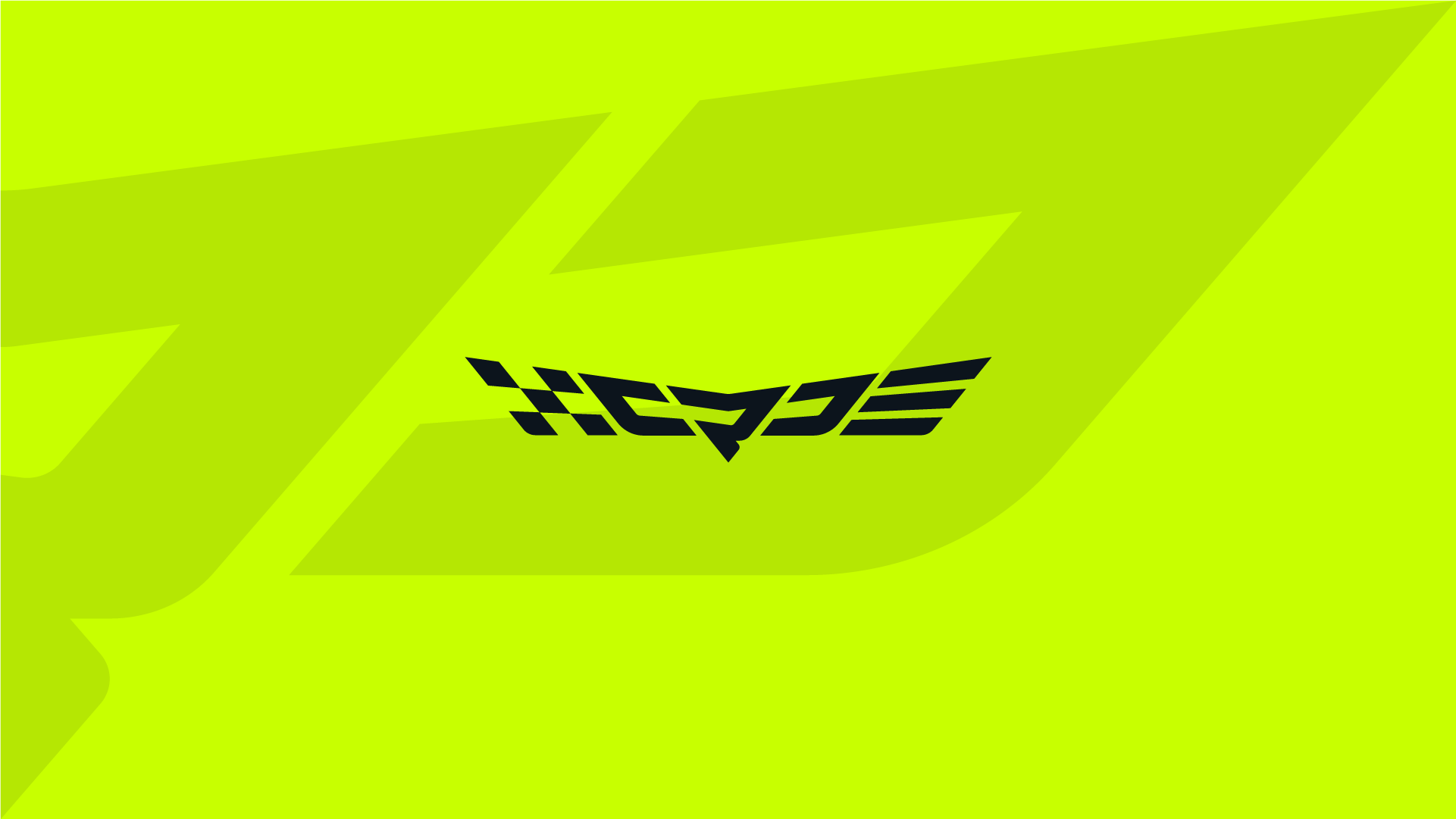
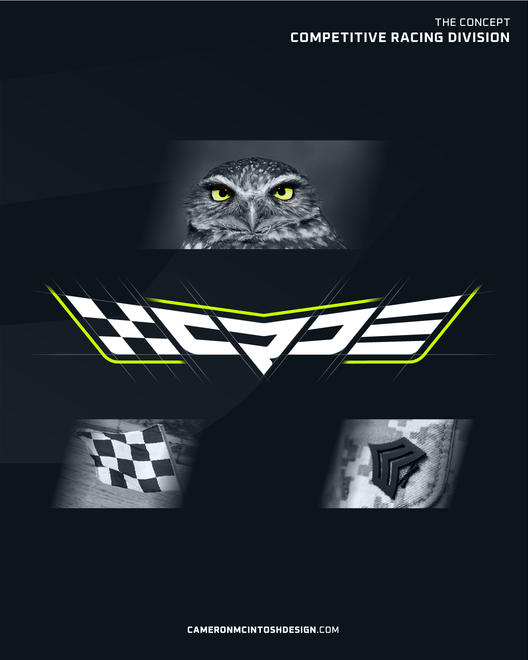
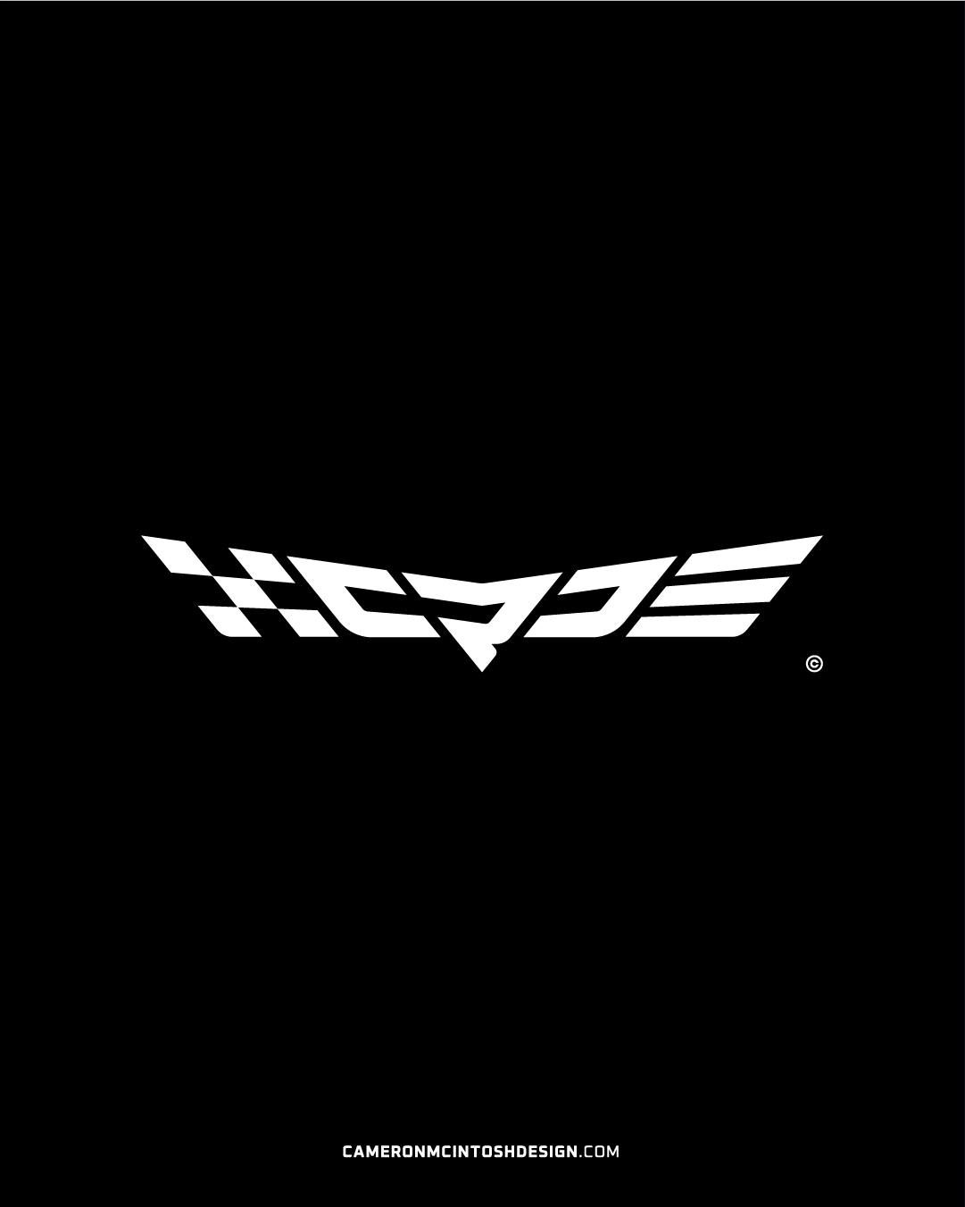
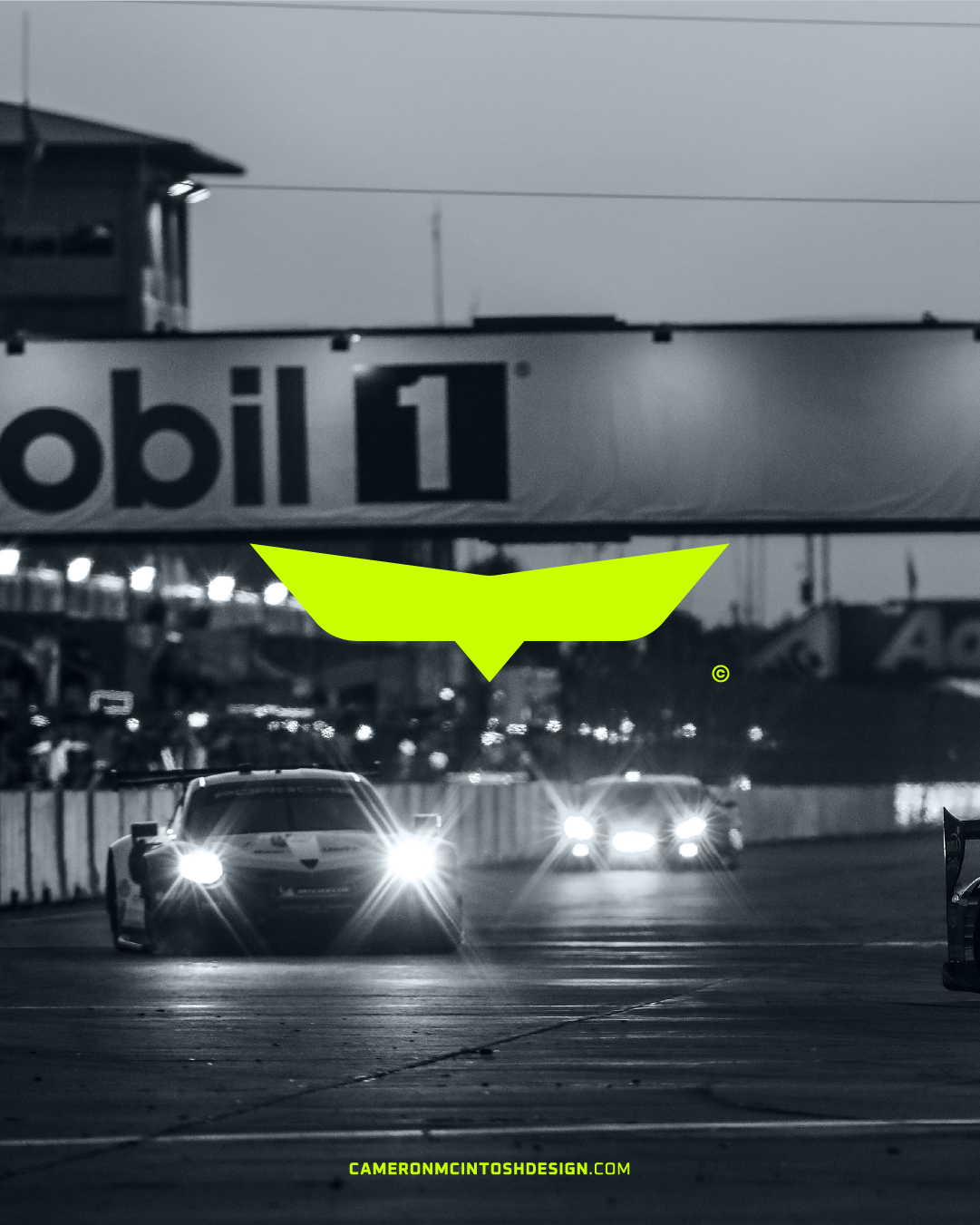
I had a mate mention an idea to start a semi-professional organisation for their sim-racing efforts going forward, commissioning me with complete creative freedom to develop the team's identity. The main logotype is in the shape of an owl's glare, representing speed and determination, with the eyes being the C and D, with the stylised R being the beak! 🦉
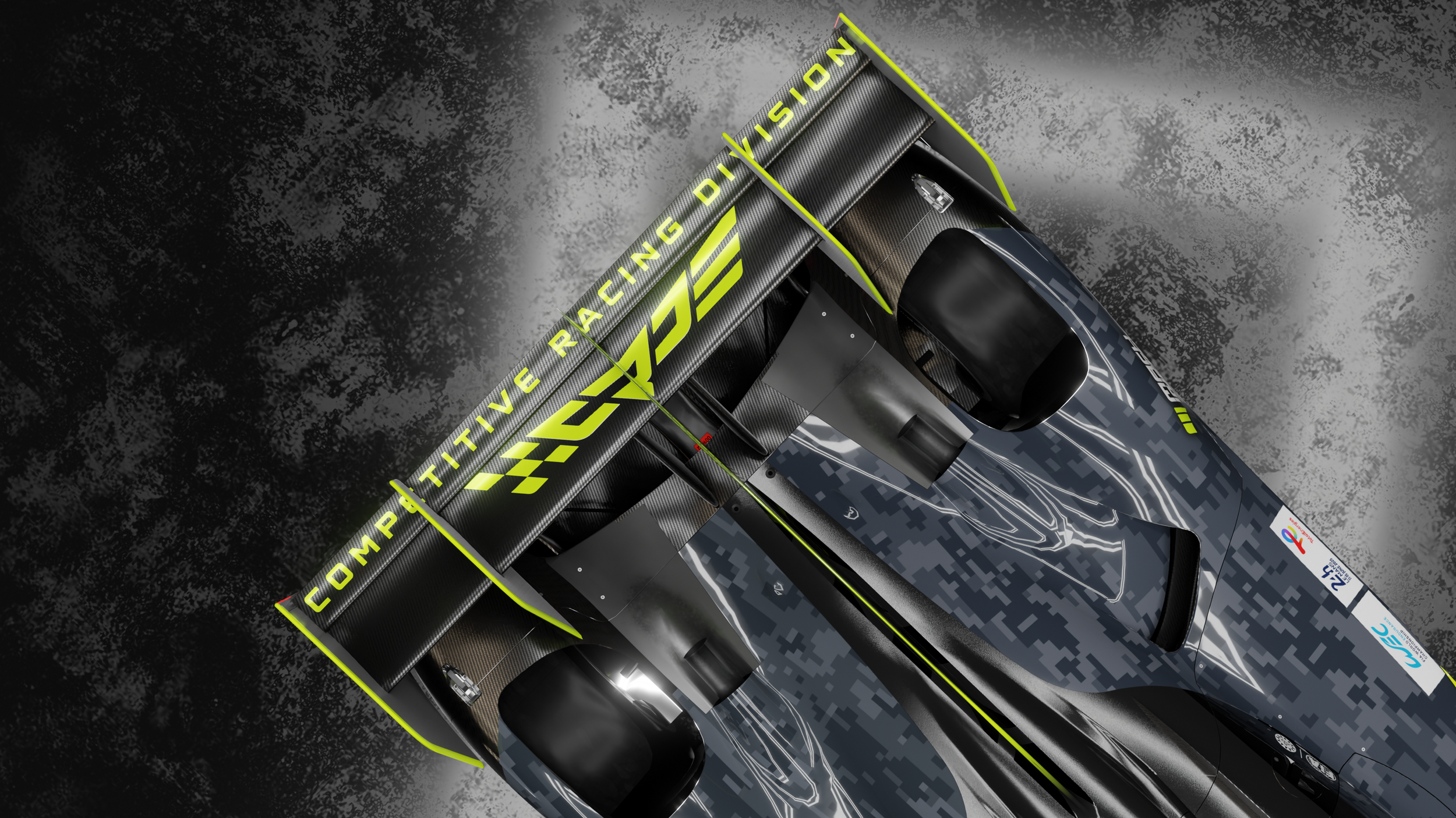
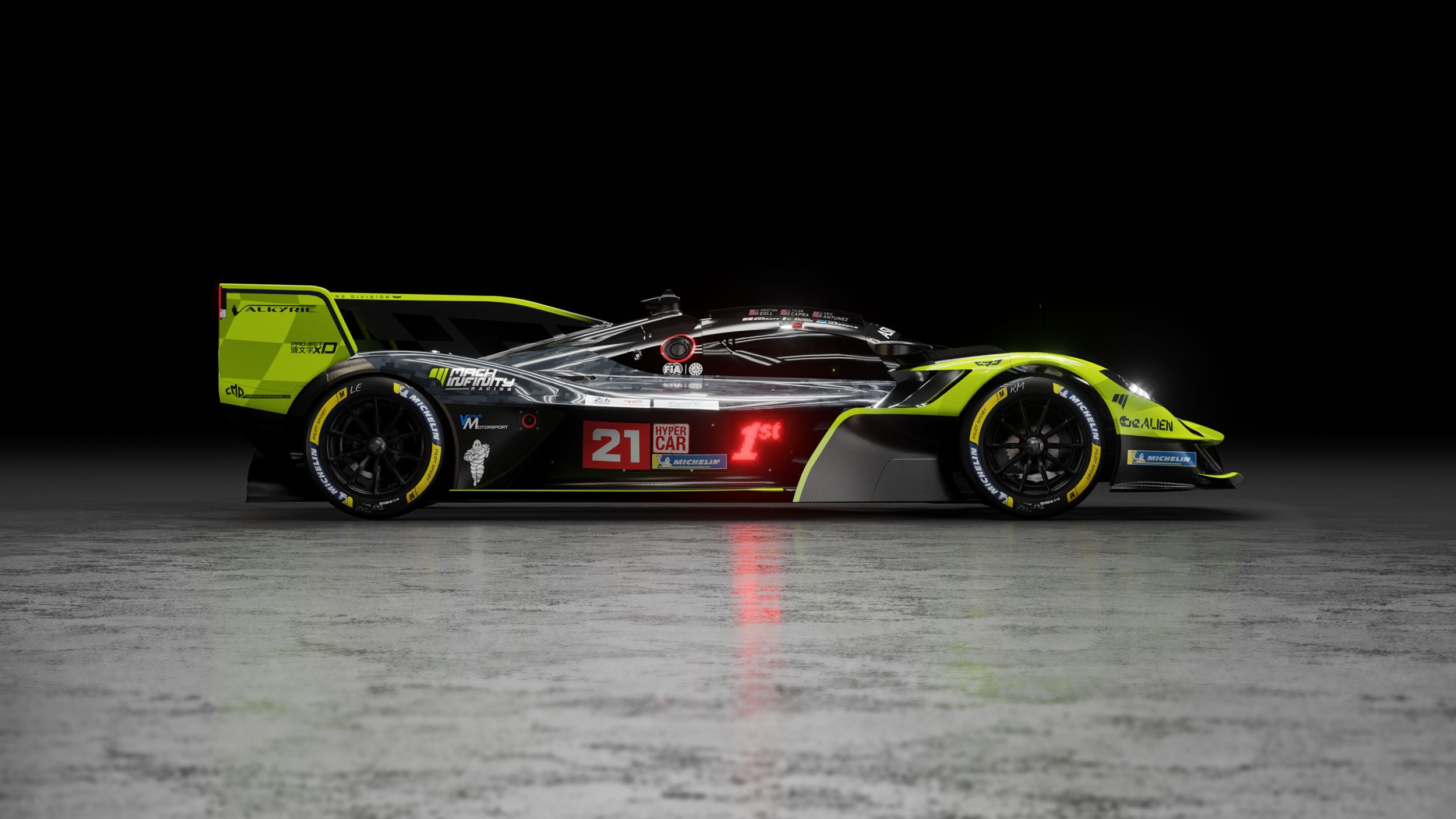
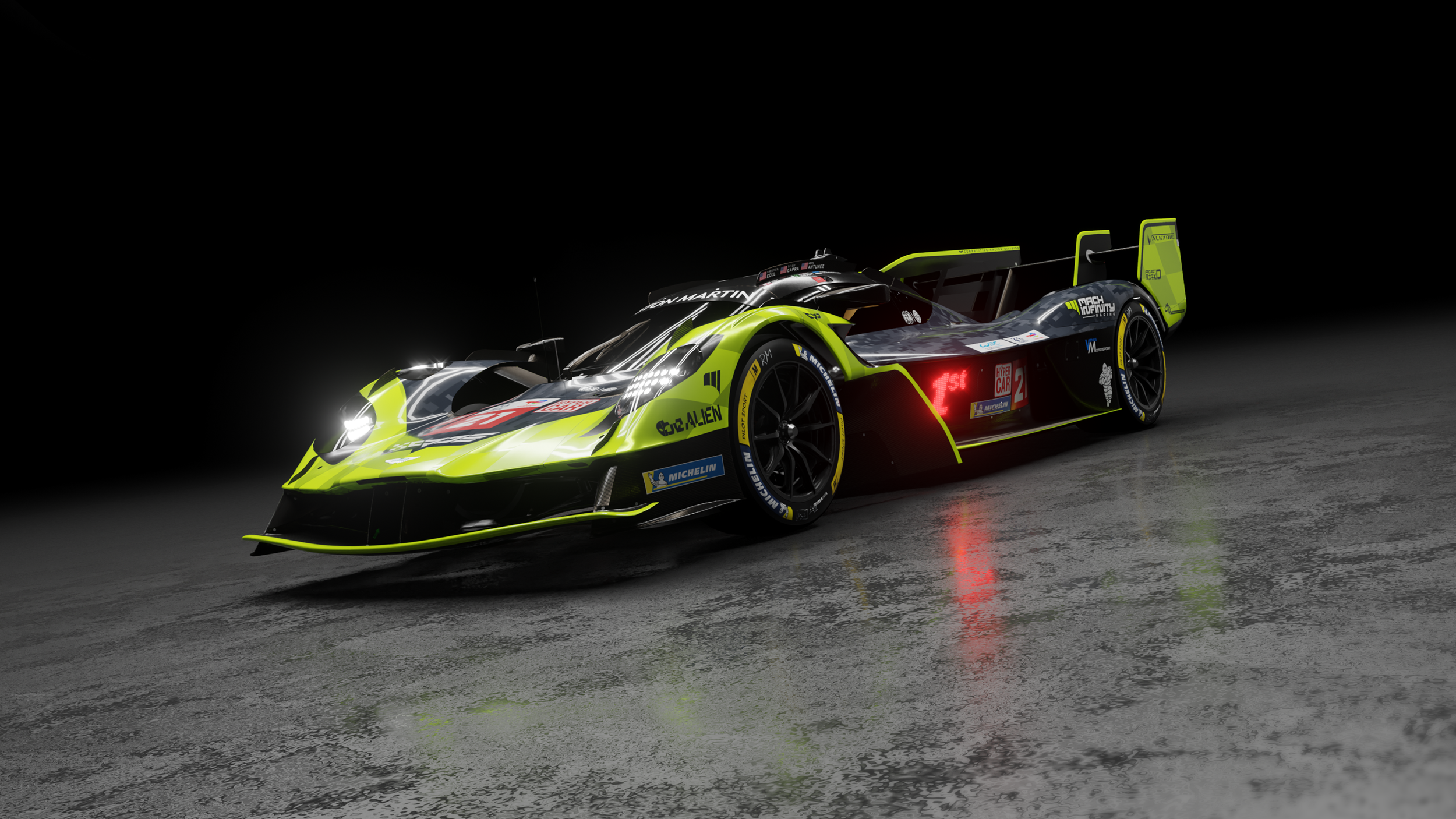
From this, I began testing out various ways of representing this brand identity on the body of a race car for the upcoming LeMans Ultimate 24hr test. Incorporating the checkered flag portion of the logo onto the hood, I framed that with the angles of the logo and accented it all against the vibrant green.